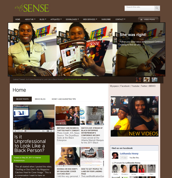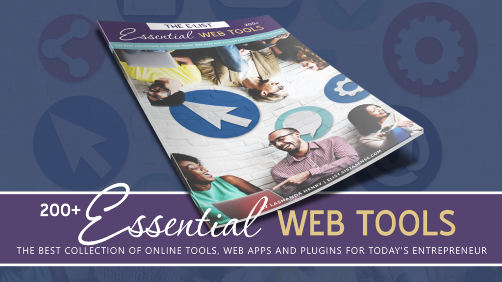

I’ve been thinking about changing the look of sistasense.com for about a month now. After coming back from the BE Conference last week I started to get a new list of web clients, so I figured before I get too busy I would work on my website 1st (BIG SMILE). I am very happy with the new look and excited to share it with you all. As you can see from the images above, I wanted to maintain the brand colors and layout style but at the same time I really wanted to add a dynamic featured content rotator to the website in combination with a better top navigation. While I was setting up my dropdown menus I realized how much content was NOT accessible to readers because I didn’t use drop down menus before and there is only so much you can put in the sidebar. Well … I am still tweaking this new look, but so far so good.
As I am sure you know creating a new look for your website can be draining, but never think that your web design days are over. As site designs change, wordpress evolves and new widgets are created you have to make sure that your website is fresh and up to date. So ask yourself, is it time your website get’s a new look? If you ever need my web design services, you know where to find me. Just click here to send me a quick message.


Girl … Congratulations … on all that you do … Generational Wealth is the objective, teach & touch … don’t let the naysayers discourage the yoU … love is a verb … sonya la
Congrats LaShanda, you still rocking and rolliung, I love it and the site looks Fab and Congrats on the new Mag too. ~daphne aka Dwritewell
LaShanda, I love the new look. The information you provide is invaluable and this new look takes your image right over the top. Congratulations.